
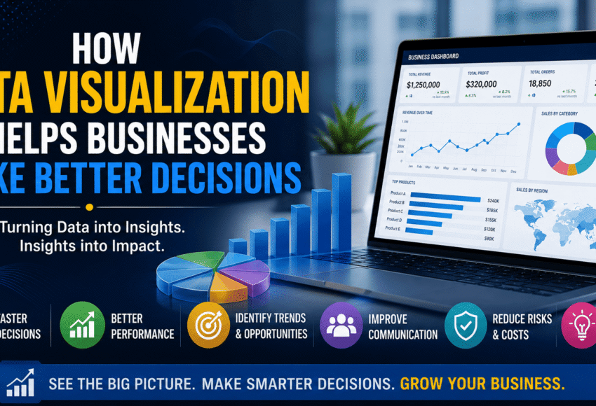
How Data Visualization Helps Businesses Make Better Decisions
In today’s data-driven world, businesses generate massive amounts of information every second. However, raw data alone cannot drive success unless it is transformed into meaningful insights. This is where data visualisation becomes essential.
Data visualisation converts complex datasets into easy-to-understand charts, graphs, dashboards, and reports, enabling businesses to identify trends, monitor performance, and make faster, smarter decisions. Whether you’re a startup, multinational company, healthcare provider, financial institution, or retail business, effective data visualisation can improve productivity, reduce risks, and uncover new growth opportunities.
In this guide, we’ll explore why data visualisation is critical for modern businesses, its key benefits, popular tools, real-world applications, and how learning data visualisation can build a successful career in data analytics and business intelligence.
How Data Visualization Helps Businesses Make Better Decisions
Businesses collect data from websites, sales systems, customer interactions, marketing campaigns, financial transactions, and operational processes. While this data is valuable, it can be overwhelming when presented in spreadsheets or databases.
Data visualisation simplifies this information by presenting it through interactive dashboards and visual reports, making it easier for decision-makers to understand patterns and act quickly. Instead of reading thousands of rows of data, executives can analyse business performance within minutes using clear visual dashboards.
What is data visualisation?
Data visualisation is the process of presenting information through visual elements such as
- Charts
- Graphs
- Dashboards
- Maps
- Heat Maps
- KPI Cards
- Trend Lines
- Pie Charts
- Bar Charts
- Scatter Plots
The primary goal is to transform raw data into insights that are easy to interpret and act upon.
Why Data Visualization Matters in Business
Businesses today make hundreds of strategic decisions every month. Data visualisation supports these decisions by making information accessible, accurate, and actionable. Key advantages include:
- Faster decision-making
- Improved business performance
- Better communication across teams
- Easier identification of trends
- Reduced reporting errors
- Real-time performance monitoring
- Improved forecasting
Top Benefits of Data Visualization for Businesses
1. Faster Decision-Making
Visual dashboards allow managers to identify business trends instantly instead of spending hours analysing spreadsheets.
For example:
- Sales performance
- Customer growth
- Revenue trends
- Marketing ROI
- Inventory status
Executives can make informed decisions in real time.
2. Easy Understanding of Complex Data
Large datasets often contain millions of records.
Visualisation simplifies complex information using:
- Interactive charts
- Color-coded dashboards
- Performance indicators
- Trend analysis
This helps both technical and non-technical users understand data quickly.
3. Improved Business Intelligence
Business Intelligence (BI) combines analytics with visualisation to provide organisations with meaningful insights.
Interactive dashboards help businesses answer questions like:
- Which products generate the highest revenue?
- Which marketing campaigns perform best?
- Which regions have the highest sales?
- Which customers are most profitable?
- Where are operational bottlenecks?
4. Real-Time Performance Monitoring
Modern visualisation tools update dashboards automatically.
Managers can monitor:
- Daily sales
- Revenue targets
- Website traffic
- Employee productivity
- Customer satisfaction
- Inventory levels
This enables quicker responses to changing business conditions.
5. Better Customer Insights
Businesses can visualise customer data to understand:
- Buying behavior
- Customer demographics
- Purchase frequency
- Product preferences
- Customer lifetime value
These insights help improve marketing strategies and customer retention.
6. Improved Financial Planning
Finance teams use visualisation to monitor:
- Profit and loss
- Budget performance
- Cash flow
- Expenses
- Revenue growth
- Forecasting
Visual reports make financial analysis more accurate and easier to communicate.
7. Enhanced Marketing Performance
Marketing dashboards allow teams to measure:
- Campaign performance
- Website traffic
- Lead generation
- Conversion rates
- Social media engagement
- Advertising ROI
This helps marketers optimise campaigns for better results.
8. Better Risk Management
Organisations use visualisation to identify potential risks before they become major issues.
Examples include:
- Fraud detection
- Financial risk
- Operational delays
- Supply chain disruptions
- Customer churn
Early insights lead to proactive decision-making.
Popular Data Visualization Tools
Several tools help businesses create professional dashboards and reports.
Microsoft Excel
Ideal for:
- Basic charts
- Pivot Tables
- Reporting
- Financial analysis
Microsoft Power BI
Best for:
- Interactive dashboards
- Business Intelligence
- KPI monitoring
- Automated reporting
- Enterprise analytics
Tableau
Widely used for:
- Advanced visualizations
- Interactive storytelling
- Enterprise reporting
- Large-scale analytics
Google Looker Studio
Suitable for:
- Marketing dashboards
- Website analytics
- Google Ads reporting
- SEO reporting
Real-World Business Applications
Retail
Retail businesses use dashboards to monitor:
- Product sales
- Inventory
- Seasonal demand
- Customer behavior
Healthcare
Hospitals analyse:
- Patient records
- Treatment outcomes
- Resource utilization
- Operational efficiency
Banking & Finance
Financial institutions monitor:
- Investments
- Fraud detection
- Customer transactions
- Loan performance
Manufacturing
Manufacturers visualise:
- Production efficiency
- Machine performance
- Quality control
- Supply chain metrics
Digital Marketing
Marketing agencies track:
- SEO performance
- Paid advertising
- Social media campaigns
- Website conversions
Skills Required for Data Visualization
To become a successful data visualisation professional, you should learn:
- Advanced Excel
- SQL
- Microsoft Power BI
- Tableau
- Data Cleaning
- Dashboard Design
- Business Intelligence
- Data Storytelling
- Statistics
- Basic Python (optional)
- KPI Reporting
Career Opportunities in Data Visualization
As organisations increasingly rely on dashboards and business intelligence, demand for skilled professionals continues to grow.
Popular job roles include:
- Data Analyst
- Business Intelligence Analyst
- Power BI Developer
- Tableau Developer
- Reporting Analyst
- Data Visualization Specialist
- Business Analyst
- Analytics Consultant
These roles are available across IT, healthcare, finance, retail, manufacturing, logistics, education, e-commerce, and consulting.
Why Learn Data Visualisation in 2026?
Businesses are investing heavily in analytics and AI-powered decision-making.
Learning data visualization offers:
- High-demand career opportunities
- Excellent salary packages
- Global job prospects
- Remote work opportunities
- Career growth in Business Intelligence
- Strong foundation for Data Science and AI
Professionals with expertise in Power BI, Tableau, and Excel are among the most sought-after candidates in the analytics job market.
Who Should Learn Data Visualisation?
This skill is valuable for:
- Students
- Graduates
- Engineers
- Commerce professionals
- Accountants
- Marketing executives
- Business owners
- Finance professionals
- Working professionals
- Career changers
No advanced programming knowledge is required to get started with most visualisation tools.
Frequently Asked Questions (FAQs)
1. What is data visualisation?
Data visualisation is the process of converting raw data into visual formats such as charts, graphs, and dashboards to make information easier to understand and analyse.
2. Why is data visualisation important for businesses?
It helps organisations identify trends, monitor performance, improve reporting, reduce errors, and make faster, data-driven decisions.
3. Which tools are best for data visualisation?
The most popular tools include Microsoft Excel, Power BI, Tableau, and Google Looker Studio. Each serves different business needs and skill levels.
4. Is data visualisation a good career?
Yes. With the growing adoption of business intelligence and analytics, data visualisation professionals are in high demand across multiple industries.
5. Do I need coding skills to learn data visualisation?
No. Tools like Excel, Power BI, and Tableau allow beginners to create dashboards with little or no coding. Learning SQL and basic Python later can further enhance your career.
6. Which industries use data visualisation?
Almost every industry uses it, including finance, healthcare, retail, manufacturing, logistics, education, e-commerce, digital marketing, and government.
7. What should I learn first?
Start with Advanced Excel, then progress to SQL, Power BI, and Tableau. Building real-world dashboard projects will strengthen your practical skills and improve job prospects.
Conclusion
Data visualisation has become a vital part of modern business strategy. By transforming complex datasets into intuitive dashboards and reports, organisations can identify opportunities, solve problems, and make confident, data-driven decisions.
Whether you’re an aspiring data analyst, business intelligence professional, or business owner, mastering data visualisation tools like Excel, Power BI, and Tableau is a smart investment. These skills not only improve business performance but also open the door to rewarding careers in one of the fastest-growing fields of the digital economy.
If you’re ready to build a future in analytics, start learning data visualisation today and gain the expertise needed to help businesses make better decisions with data.




Leave a Comment